The design of the guidance system should meet the functional requirements of the hospital to ensure effective communication between various departments and improve the operational efficiency of the hospital.
1. Safety: The design of the guidance system should comply with medical safety standards, ensure the safe operation of fire equipment, and ensure fire safety.
2. Functionality: The guidance system should provide effective information transmission function, achieve effective communication between departments, and improve the operational efficiency of the hospital.
3. Economy: The design of the guidance system requires cost savings, rational utilization of resources, and minimizing investment as much as possible.
4. Flexibility: The guidance system requires flexibility, convenience, and speed. The layout of the navigation system can be adjusted at any time based on changes in time, location, and equipment.
5. Maintainability: The design of the navigation system should consider long-term maintenance issues, take into account factors such as equipment updates, arrange installation locations reasonably, and reduce maintenance costs.
1. Each type of functional department should use pleasing hospital exclusive colors to quickly identify and highlight the display and guidance effect.
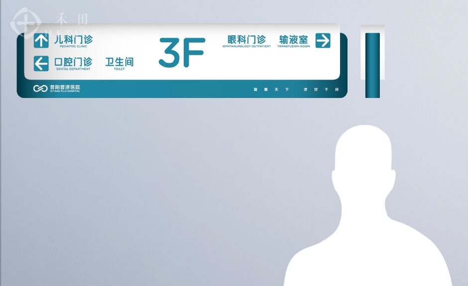
2. The hospital hall should be designed with a clearly visible overall floor plan layout of the hospital, and there should be guiding signs and parking signs for outdoor access to the hospital.
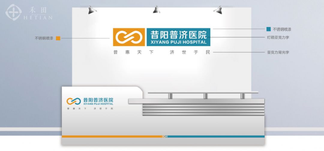
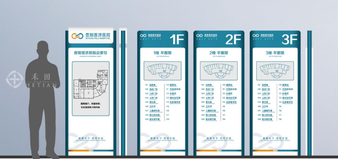
3. After entering the front hall of the outpatient building, there will be channel diversion signs, secondary guidance signs for the nature of the unit, functional distribution of each floor department, expert introduction and consultation status, name signs for each department, ward signs, inpatient department, outpatient area, public warning signs, fire warning signs, etc. There are eye-catching wall mounted signs next to the elevators in the inpatient department area, indicating the floors of each department.


4. In the naming of buildings, numbers, letters, and other names are used, which is simple and easy to remember. Mark the building code on the floor plan at the entrance, and display the location of each department with multi-level signage inside the building. The signage oriented system is particularly important for hospitals. When designing and planning, it should be closely combined with the actual situation to achieve accuracy and comprehensiveness, so that even first-time visitors can smoothly find their destination.
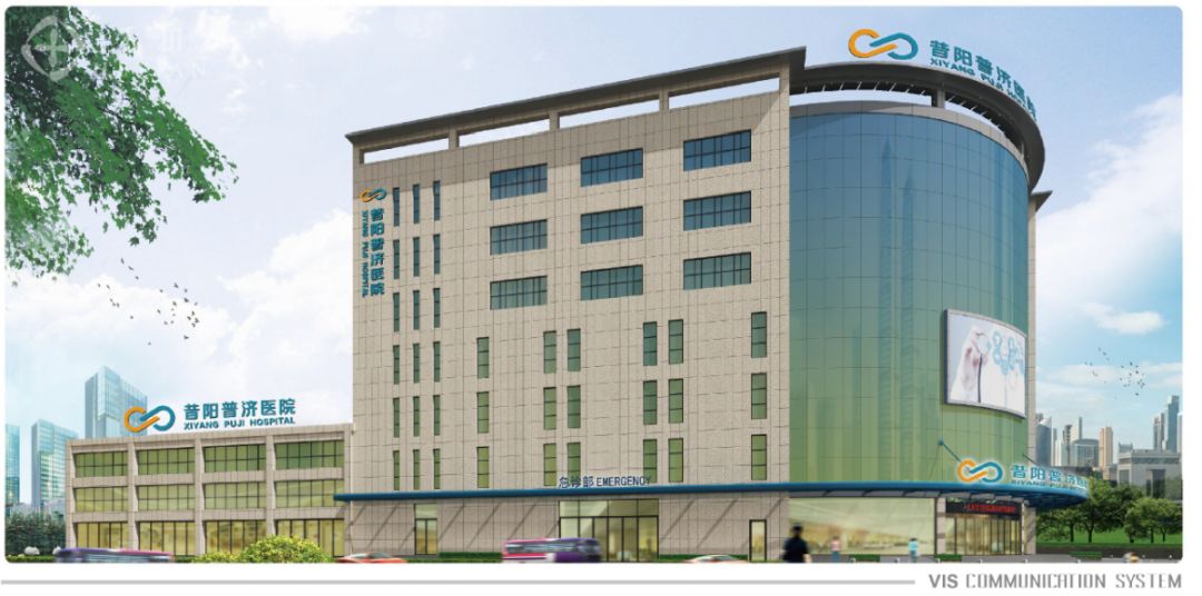
A successful hospital signage guidance system should provide visual clues to the audience to help them locate themselves in their current position. Each area or location should have a unique design (clear organization and designation) to help the audience identify which direction they are currently facing and which direction they are facing. An unforgettable landmark or waypoint that helps the audience identify their environment and clearly indicate the destination, allowing people to see where they have gone.
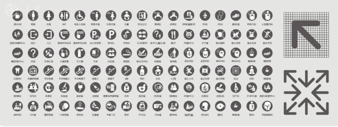
Humanization is an inevitable trend in the progress of the times and social development. In comprehensive hospitals, the concept of humanization is particularly sensitive and important.
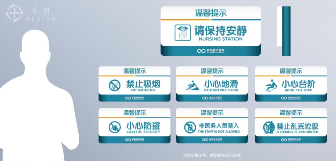
The production of some directional signage systems should consider the visual capture effect in nighttime environments and low light conditions;
The carrier of the directional identification system should conform to people's reading habits in terms of material, size, sight distance, graphics and color expression, so that people can accurately and quickly obtain directional identification information;
The setting of the signage system should also take into account the physiological and psychological characteristics of children, pregnant women, the elderly, and people with disabilities, so that they can feel the rationality, comfort, and warmth of the medical treatment process through a humanized signage system;
Finally, humanizationThe language and patterns in the signage system should have affinity to create a relaxed and harmonious medical service atmosphere, thereby reflecting the brand connotation of "people-oriented".
A comprehensive hospital should be a rigorous and orderly environment. The design and production of the hospital signage system cannot be arbitrary, it needs to adapt to people from different regions and cultural levels. The lack of a unified and standardized hospital signage system can easily convey confusing guidance information to people, and even create a negative impression of loose hospital management, low technical level, and outdated brand awareness.
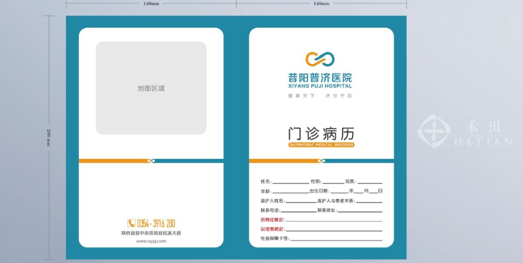
In order to achieve the goal of serialization and integration, the design and production of hospital oriented signage systems should adhere to the principle of combining principles and flexibility in terms of materials, dimensions, and graphic and textual arrangement.
The application of directional signage systems in comprehensive hospitals is not isolated, it presents a holistic and coherent design, production, and implementation state. Each unit and individual of the guidance sign system should exhibit accurate and distinct connectivity, enabling guidance sign information to be guided layer by layer, thereby avoiding the phenomenon of "gaps" in guidance information.


